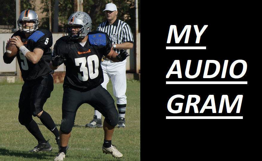
How to design a good audiogram/video for a mobile viewing device:
1. Choose an image that isn't too busy
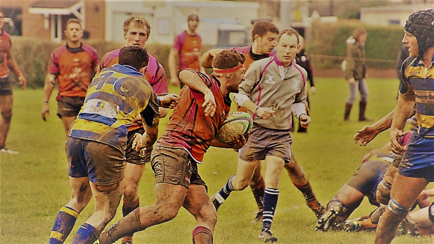
The following image looks great on a bigger screen, but as it gets smaller, it becomes much harder to tell what is going on.


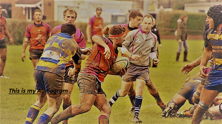
2. Choose a large font size
Here the text is legible in the bigger picture, but by the time it shrinks to a smaller size no one will be able to read what it says.


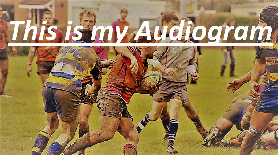
Here the picture doesn't communicate as much as the image gets smaller, but at least the font size is big enough that it can still communicate whatever message you want to get across.


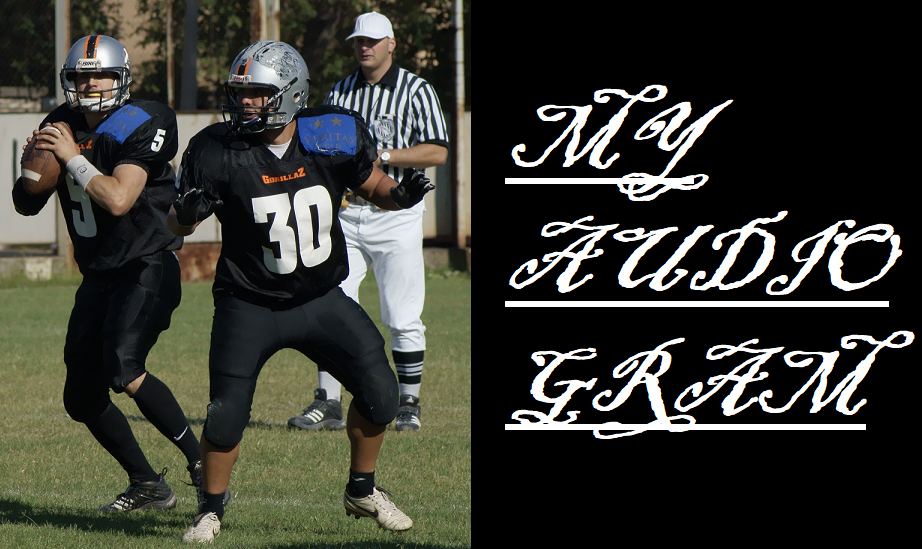
3. Choose a clean looking font
The smaller the screen, the more important it is to have a clean looking font. Below is an example of a font that becomes impossible to read once you get smaller. Compare it to the example at the end of the article.


Example of good mobile design:
The image and text are clear even as you get much smaller.
